This is a continually updating post about speedrun marathon layout design. This focusses on anything and everything about speedrun marathon layout design so it might not flow perfectly. More in-depth analyses or implementations for elements might be separate blog posts but will be linked here.
Table of contents
- Table of contents
- What are speedrun marathons?
- Balance
- Layout elements
- Who am I?
- Basic rules
- Elements
- Aspect Ratios
- Changelog
What are speedrun marathons?
This may sound basic but it is important to remember what the goals are for a speedrun marathon when designing layouts. A speedrun marathon is an event where multiple people will speedrun multiple different games sequentially one after another. These events can be to raise money for charity or to have a community event where everyone gets together.
Balance

The most difficult thing when it comes to speedrun marathon design is the balance between giving as much information as you can while also trying to not clutter and overload the layouts.
Giving a lot of information is really good to people with experience in speedrunning but can be difficult to manage space wise but can be very overwhelming to new people. If the marathon is for the given speedrun community then you can get away with including more information. However if the marathon is more general it may require less information to not overwhelm new people.
Finding the correct balance takes time and feedback and everyone does it a little bit differently.
Layout elements
Crucial
The pure basic essentials that are needed for a speedrun marathon are thus:
- Gameplay
- Timer
- Game name
- Speedrun category
- Runner name
- Intermission screen
- Amount raised so far & charity name
All other data seen in speedrun marathons help provide more context but at the end of the day, those are the essence of a speedrun marathon.
Recommended
These should be on the layouts in some manner but are not the core elements.
- Run estimate
- Camera
- Pronouns
- Current time at the location
- Upcoming runs
- Commentator and Host names
- Ticker/Omnibar
Nice to haves
These are elements that require extra design and/or programming to implement.
- Game year
- Game console
Who am I?
I currently work for AusSpeedruns working on both the layouts and now website and anything else to do with the more software side of tech. I’ve been developing the AusSpeedruns layouts since 2020 working on 8 events (so far!)
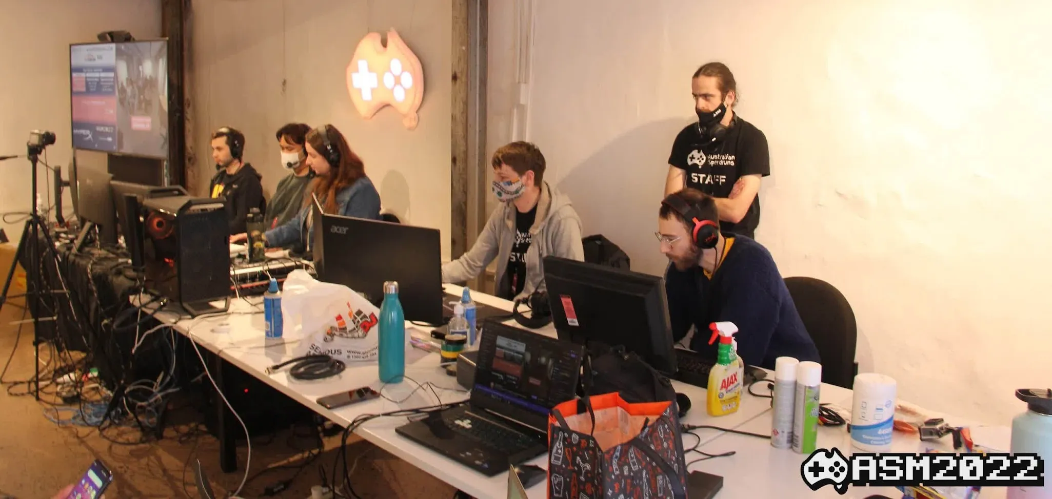
I’ve been interested in layouts since finding out about Awesome Games Done Quick in 2016.
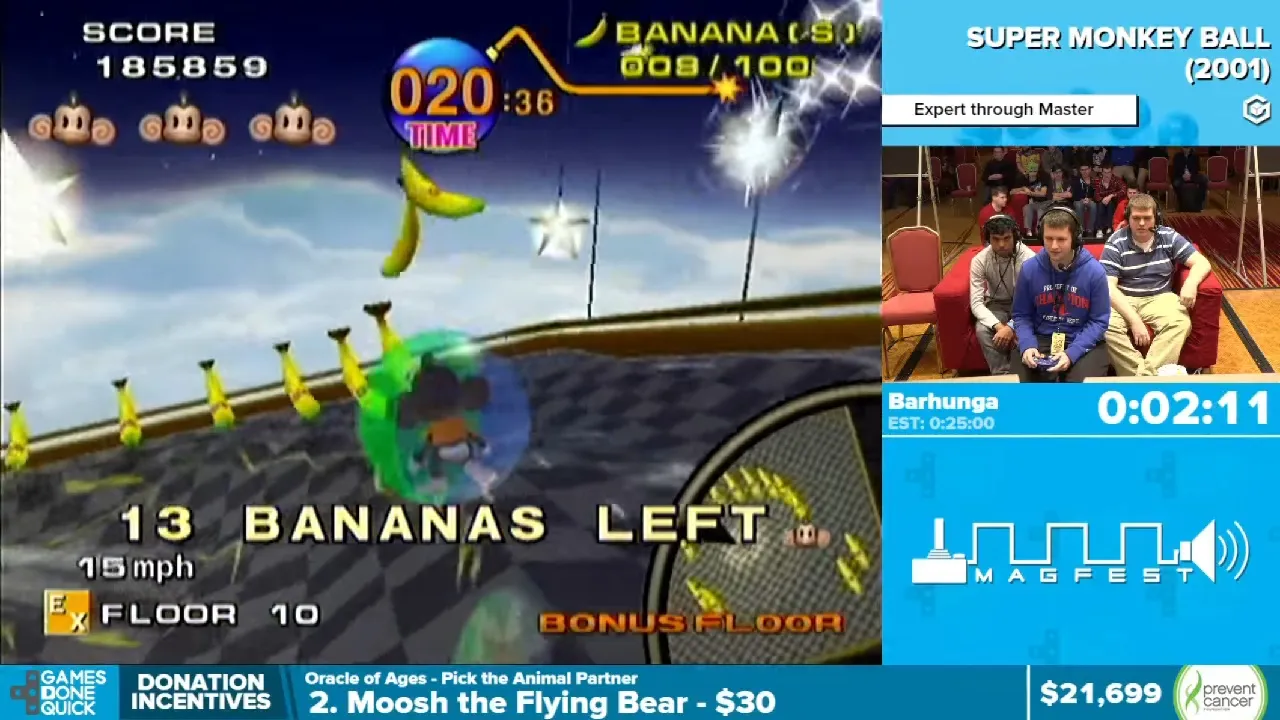
My first love. Link to run
My very first design I showed someone was in 2018. Looking back on it now I don’t think it’s the worst. A lot of negative space but 16:9 layouts are generally difficult because of how much space you have to fill.
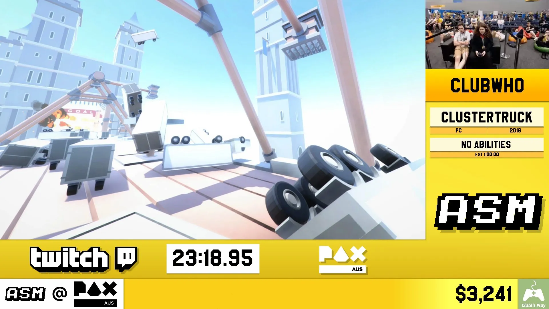
They rejected me… but I talked to them in person at PAX 2019 and became the designer and developer for ASM2020. Since them I’ve designed 8 events over 3 years, continually improving and refining the layouts.
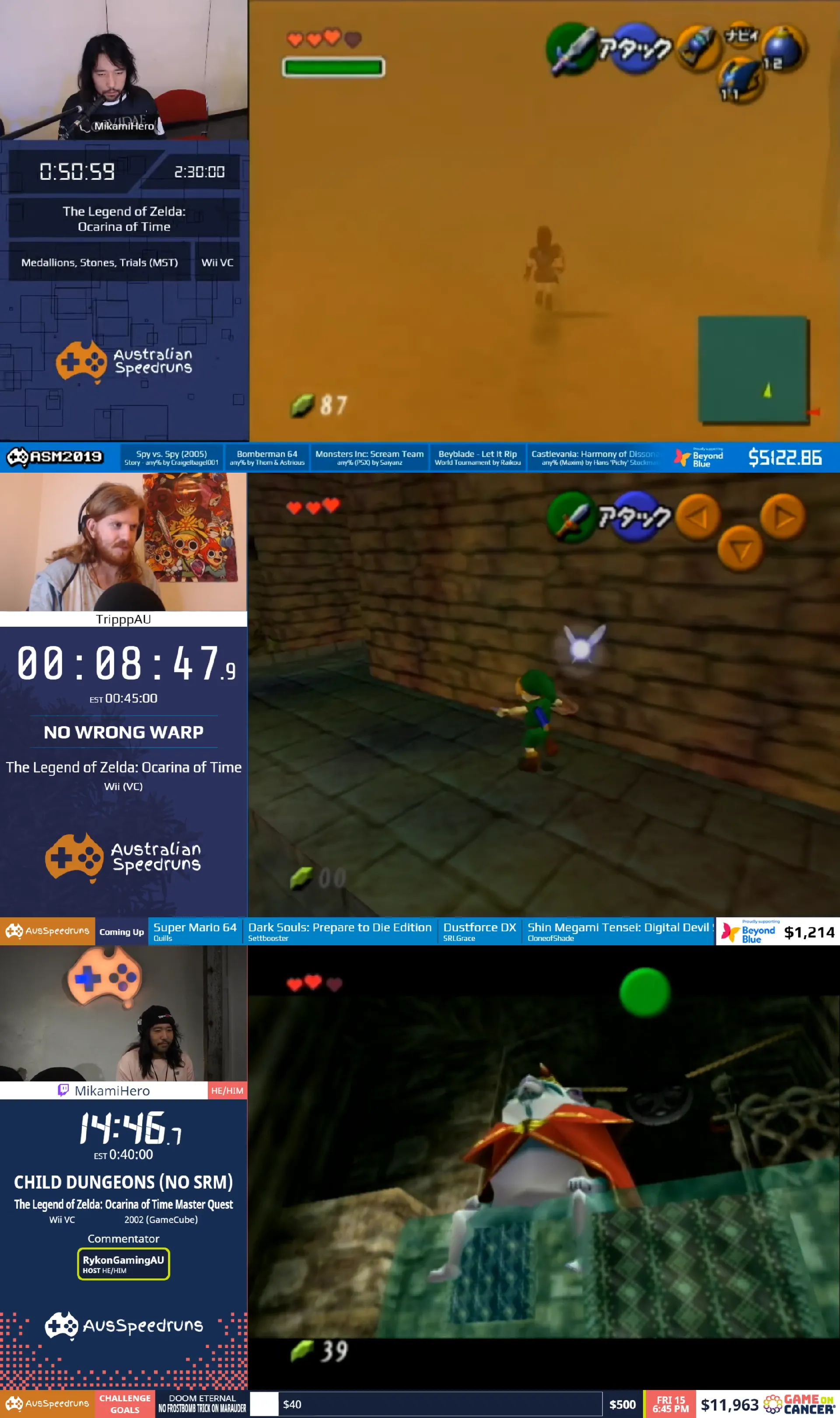
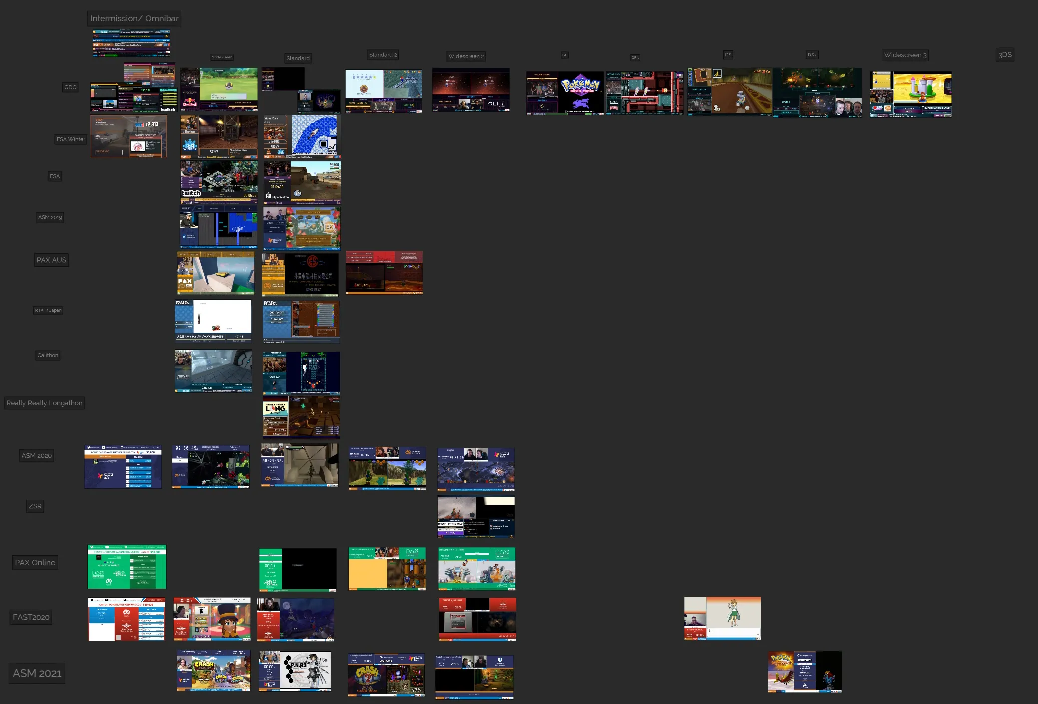
In designing these layouts I have looked at many events analysing what they do and where they place things.
Basic rules
There are some basic/general rules to follow when designing layouts.
- No graphics or information overlapping the gameplay.
The gameplay screen should always be clear, you should never cover any of the game as many games have different position for elements like UI which may get covered. Also keeping readability of elements will be difficult as the background will always be changing.
- Numbers that change need to use a monospace font
This should be a general rule for ALL graphics but absolutely any number that will increment, decrement, whateverment itself needs to use a monospaced font so as to not cause changing element widths. Once you look out for elements that hold numbers you will see the changing widths. Numbers that will change the again, need a monospace font are: Timer, Donation total, Clock time.
Elements
The following descriptions and recommendations are of course based on my opinions of these things.
Gameplay screen
This is the most crucial element of the whole layouts. Every other element is related to giving the gameplay more context. At AusSpeedruns the first thing when designing a new layout is how big can we make the gameplay screen while also having space to put the other elements in. I will minimise the space around the gameplay so as to maximise the screen.
Timer
Requirement: Crucial
This is a speedrun marathon so of course we need a timer! The timer should be large and easily viewable at a glance. It needs seconds, minutes and hours.

It is a good idea to omit the hours values when below an hour to remove useless information as it takes a whole hour for those digits to be useful. You shouldn’t omit the minutes as it takes a much shorter amount of time to reach 10 minutes.

Milliseconds are not a required part of the timer but can be used as a bit of constant visual change in case of sections of games that might be quite still. As they are not important to the actual time I make the milliseconds smaller but some events keep them the same size as the rest.
Game name

Requirement: Crucial
This one should be pretty obvious why it’s required.
An issue you will run into is that game names can be very VERY long (I used to speedrun ” Mario & Sonic at the Olympic Games Tokyo 2020”). This can be a challenge as we only have limited space. You need to use text fitting algorithms and elements to do this which will either make the font size small enough so it all fits in or squishes the text so it fits in (my preferred option).
Speedrun category

Requirement: Crucial
This tells the viewers what specifically is being run. This is crucial because you need to know what type of run is being played and some categories can explain the rules (e.g. Glitchless).
Acronyms should not be used unless the name is incredibly long. This is because people watching the event may not know what something like NMG (No Major Glitches) or GSR (Ganondorf Source Requirement). But when the category name is incredibly long and the space is limited you may choose the acronym.

Runner name

Requirement: Crucial
Who is currently running the game. It’s crucial because you need to give credit.
As usernames can be so varied and different, it should be obvious what is the runner’s name as to not get confused with other information on the screen.
If there is space it would be nice to include the runner’s social information as well, especially if it is different to their normal username (e.g. My username is Clubwho but it’s @Clubwhom on twitter). This helps viewers know where to find more of a certain runner if they enjoyed the run. Space may be limited but at AusSpeedruns our nameplate has 3 states it can be in: username, switching between username and twitch and static on twitch if username and twitch name is the same.
Intermission screen
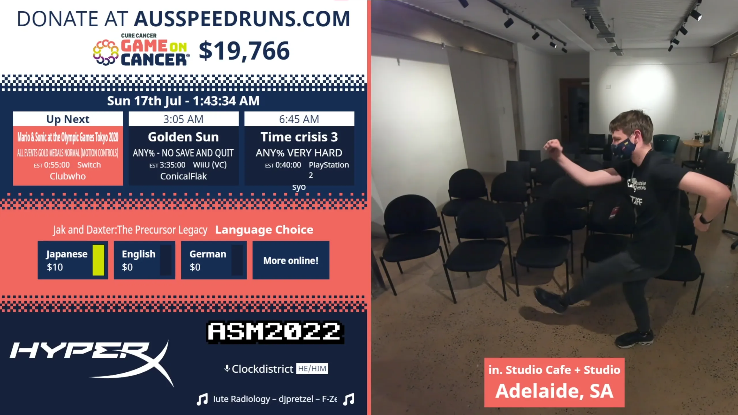
Requirement: Crucial
Between runs there needs to be some sort of intermission or break screen. This is a great opportunity to show information about the speedrun.
Information that can be shown:
- Marathon logo
- Upcoming runs
- Charity name and amount raised
- Incentives
- Prizes
- Intermission music playing (We use rainwave.cc OC Remix)
- Camera feed of the event
- Ads
Run estimate

Requirement: Crucial
The upper end of long the run should take to complete. This is crucial as it allows the user to plan their actions around the run.
The 10’s of hours should be omitted as it is unneeded information, having a the 1’s of the hours will be fine. The information should be represented with a label of either “Estimate” or “Est” as having a random time value might be confusing for new viewers.
Amount raised so far & charity name

Requirement: Crucial (if doing a charity event)
Pretty obvious but if you’re raising money for charity you should have on screen who you are raising money for and how much you have currently raised.
Camera

Requirement: Recommended
Shows the runner currently doing the run. It is recommended as it allows people to have a more human connection but it is not required as the camera is not what people are mainly looking at.
The camera needs to be a size that is big enough to see but not big enough to start taking the gameplay space.
Pronouns
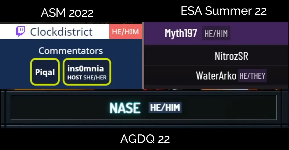
Requirement: Recommended
In the current day and age it is customary for pronouns to be included next to a person’s name. It is not crucial because a person’s name is enough.
The pronouns should be optional as well as some may not be comfortable putting their pronouns on stream.
Current time at the location
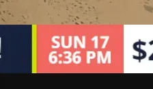
Requirement: Recommended
If an in-person event it allows a lot more context as to the reasons why an event might be quiet or have long runs (e.g. Night time). We put ours in the ticker next to the amount raised.
Commentator/Host names

Requirement: Recommended
It is customary to have commentators on while the runner plays as to provide more insightful commentary about the game while the runner focusses on speedrunning.
To have phantom voices randomly can be confusing to people so including names for the commentator and the host is recommended but it may be difficult to find space for it.
The host should be included but has to be marked as such to allow people to know who is there for the speedrun and who is there for the marathon.
Ticker/Omnibar information
Requirement: Recommended
A ticker as it’s traditionally called or what Games Done Quick calls an “omnibar” is the ribbon at the bottom or the screen that can be used to put extra information that isn’t necessary or more directly related to the marathon itself rather than the current speedrun. It can also be a good place to put a channel bug and information about the charity and amount raised.
Upcoming games
As there is little room on the ticker, only include the game name and either the category or the runners name. Only do at max the next 3 runs since generally that’ll be enough to fill the ticker.
Call to Action (CTA)
The call to action is where you put the donation link or website. For AusSpeedruns I include a bit about donation challenges as well and if the charity has a “X amount donated means Y”, I will include those as well to show the impact we are having.
Prizes
Give the name of the prize and how much it costs to enter.
Incentives
Incentives or “donation challenges” (incentives sounds too artificial to me tbh) should be shown in the order that they are being finished. Don’t show all the incentives as if you are doing a large event it will take a while to go through them.
Game metadata
Requirement: If you can
This data is mainly for people unfamiliar with the current game and not so speedrunners of the game itself.
Console/Platform
This allows viewers to see what console the game is on.
This can get confusing when some speedruns use newer releases of the same game but are on different consoles such as PS1 games being run on PS2. This can be even more confusing when games are slightly different on the new release but almost considered the same game such as Sonic 2 which was re-released on mobile in 2013. This is still something I haven’t quite nailed down as I believe it’s information for people who don’t know the game and need context but speedrunners of the game might get annoyed as the game is actually being run on a different console (e.g. The Legend of Zelda: Ocarina of Time is a Nintendo 64 game but the major categories are pretty much exclusively WiiVC). The compromise we landed on is to have the console being run on as it’s own thing and then next to the year of release we have the original console in parentheses.
Year of release
This allows viewers to see when the game was released.
It isn’t at all necessary but according to this tweet it seems that people like it.
Aspect Ratios
People like to speedrun games from all years on all different consoles. This leads to very interesting aspect ratios that games run at. It can get even more interesting when you add races or co-op games which require multiple screens into the mix. Images shown are of the AusSpeedruns layouts as of 2022.
List of consoles and their aspect ratios / resolutions
If you’re ever unsure about aspect ratio, the Aspect Ratio Calculator (ARC) has done wonders for me.
| Console | Aspect Ratio | Base Resolution |
|---|---|---|
| PC Widescreen | 16:9 | Multiple, typically 1920 x 1080 |
| PC Standard | 4:3 | Multiple, typically 1440 x 1080 |
| PlayStation 1 | 4:3 | 640 x 480 |
| PlayStation 2 | 4:3 | 640 x 480 |
| PlayStation 3 | 16:9 | 1920 x 1080 |
| PlayStation 4 | 16:9 | 1920 x 1080 |
| PlayStation 5 | 16:9 | 1920 x 1080 |
| Nintendo NES | 16:15 but to stretch to 4:3 | 256 x 240 |
| Nintendo SNES | 8:7 but to stretch to 4:3 | Multiple, typically 256 x 224 |
| Nintendo 64 | 4:3 | 640 x 480 |
| Nintendo GameCube | 4:3 | 640 x 480 |
| Nintendo Wii | 4:3 | 854 x 480 |
| Nintendo WiiU | 16:9 | 1920 x 1080 |
| Nintendo Game Boy | 10:9 | 160 x 144 |
| Nintendo Game Boy Color | 10:9 | 160 x 144 |
| Nintendo Game Boy Advance | 3:2 | 240 x 160 |
| Nintendo DS | 4:3, 4:3 | 256 x 192, 256 x 192 |
| Nintendo 3DS | 5:3, 4:3 | 400 x 240, 256 x 192 |
| Nintendo Switch | 16:9 | 1920 x 1080 |
| Sega Master System | 4:3 | 256 x 192 |
| Sega Game Gear | 10:9 | 160 x 144 |
| Xbox | 4:3 | 854 x 480 |
| Xbox 360 | 16:9 | 1920 x 1080 |
| Xbox One | 16:9 | 1920 x 1080 |
| Xbox Series | 16:9 | 1920 x 1080 |
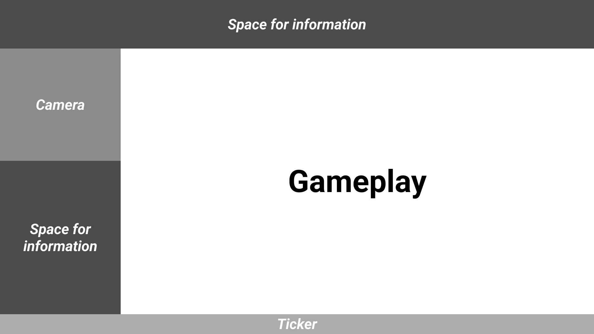
16:9 / Widescreen
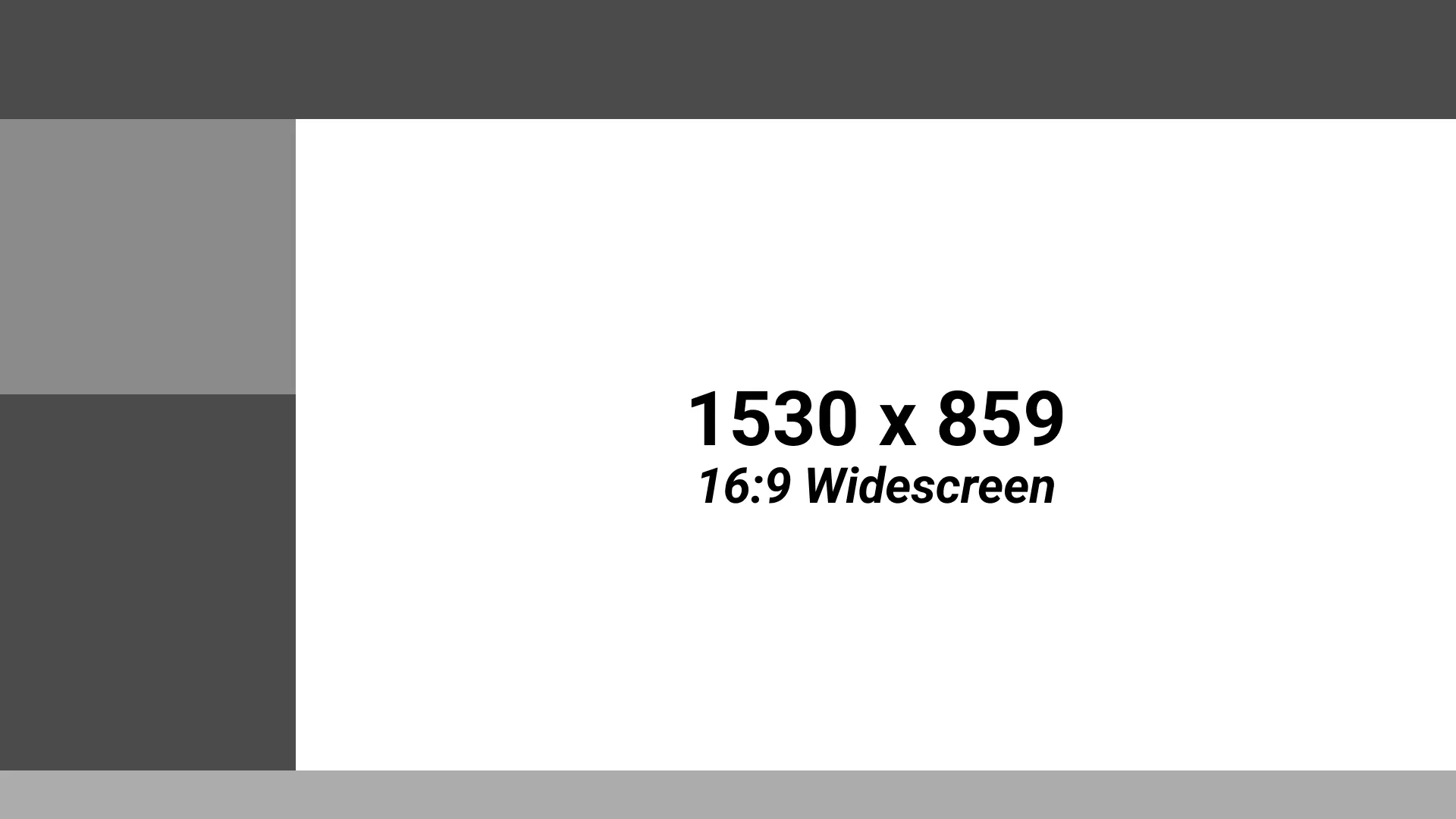
This I find is the hardest aspect ratio to nail down. You need to shrink the gameplay screen down to allow for the marathon elements but you also need to maximise the gameplay screen. This immediately leaves you with a lot of room to fill in. The good news is that there is a lot of inspiration on Twitch as most people will stream 16:9 games (though a lot of people just have elements on top of the screen which I despise but oh well).
For my layouts the gamescreen is determined by how wide the camera box is. I’ve gone for our camera to be essentially a 1:1 aspect ratio. It does mean for large groups it’s difficult or impossible to fit everyone in but as those groups are rare it can fit 2 people.
4:3 / Standard
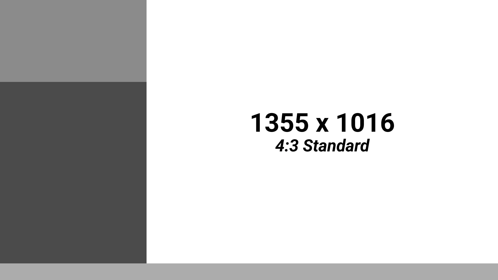
This is my favourite aspect ratio as the whole gameplay screen can fit inside a widescreen layout and have a lot of room for our elements.
DS / 3DS
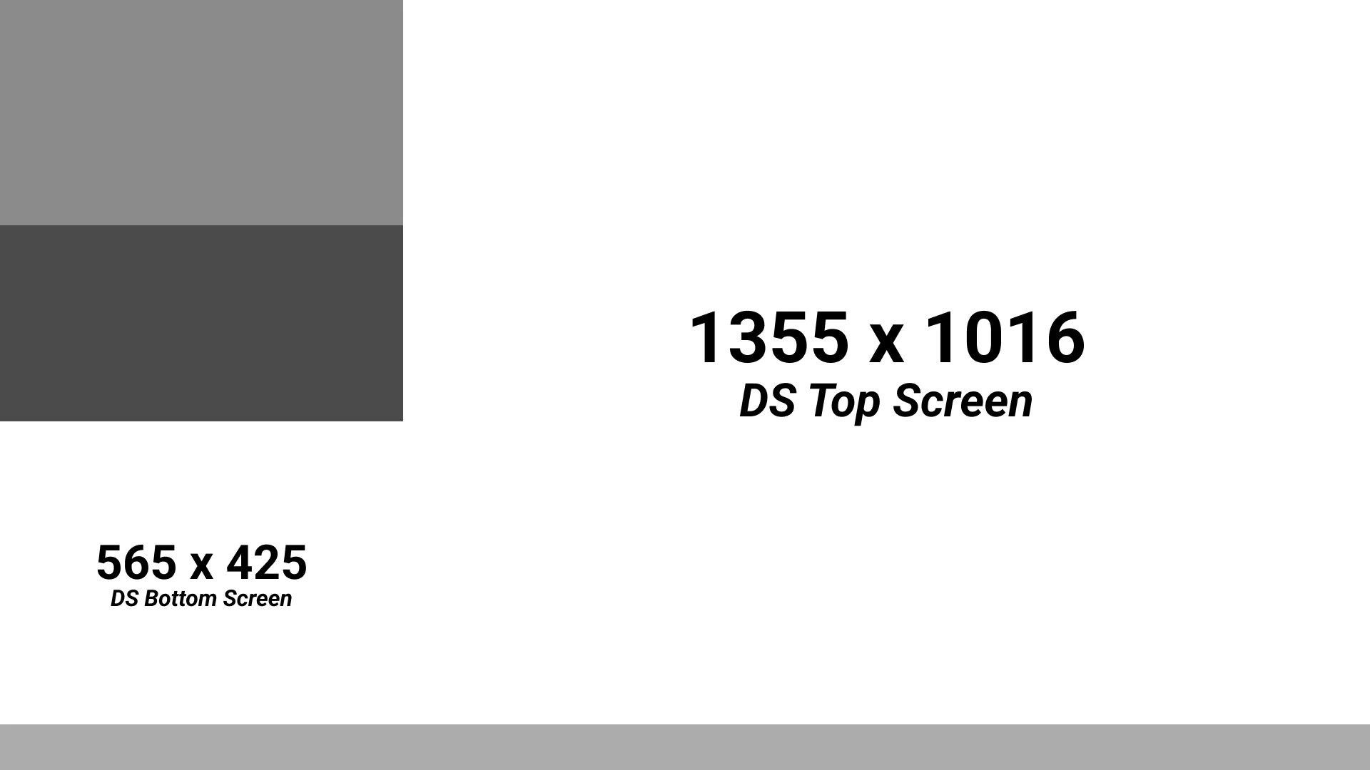
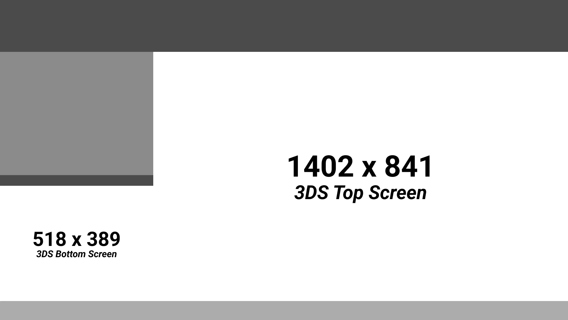
These can be difficult to maintain the “gameplay as large as it can” mantra as the second screen takes up a lot of space. Add a camera element into the mix and you suddenly have a very very small area to put all the other information. I have omitted information deemed not crucial only leaving the pure run information in a tiny compressed box.
GB / GBC
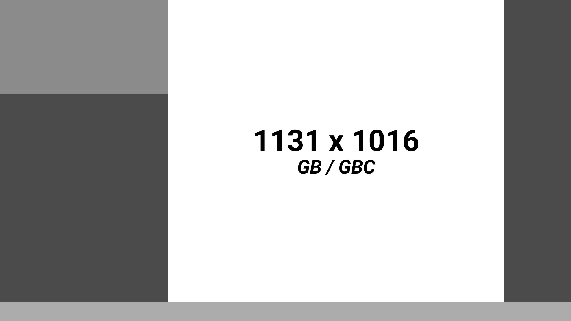
GameBoy and GameBoy Color are the same size which is fortunate. The aspect ratio does mean it leave a lot of space to fill in. I’ve decided to try and centre the gameplay and leave the right side for some random abstract designs.
GBA
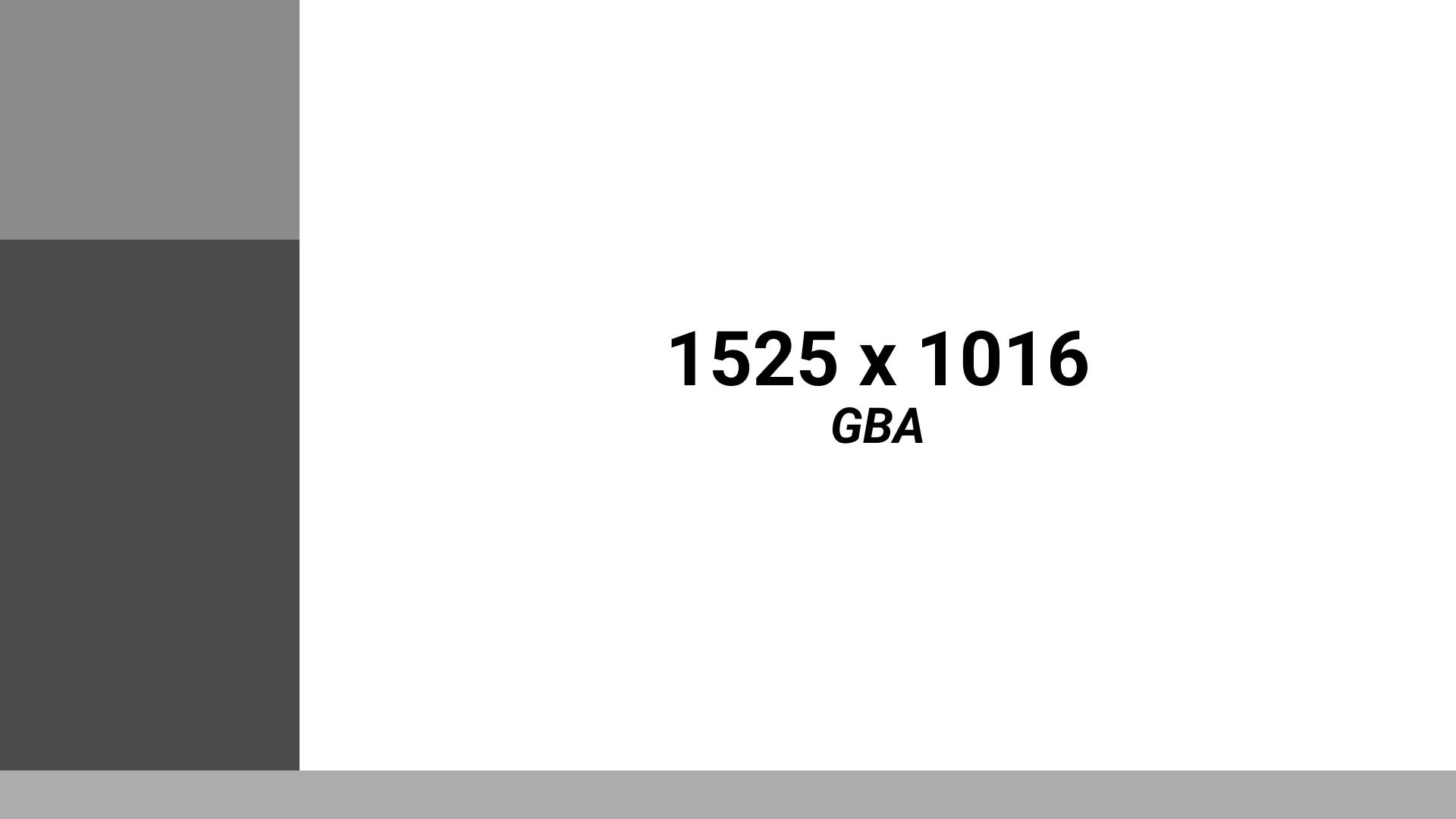
It is possible to have the GBA as the height of the available space however it does leave a thin space for information. It is thinner than ideal but reducing font size can help fit in the space.
Race/Co-op
Multiple screens are difficult to manage as you have to clearly show who is the speedrunner for each section while also maximising gameplay real estate. For 2 player games this is manageable as you can easily split the screen in half vertically and mirror the layouts. More gets tricky which we will jump into.
Game audio indicators
With multiple people gaming you should only be playing from one audio source at a given time. The runner whose audio should be playing should be the person in the lead, if its back and forth and neck and neck then try to keep changing it to a minimum to not disorient viewers.
The graphics need to show whose audio is currently playing though. We complete this by having a little audio flag that animates in or out next to the runners name.
2 player
As stated just before the easiest way to do 2 player layouts is to mirror the layouts vertically, giving each player a half of the screen. As resolutions are even numbers though you will have to have a 2 pixel border in the middle.
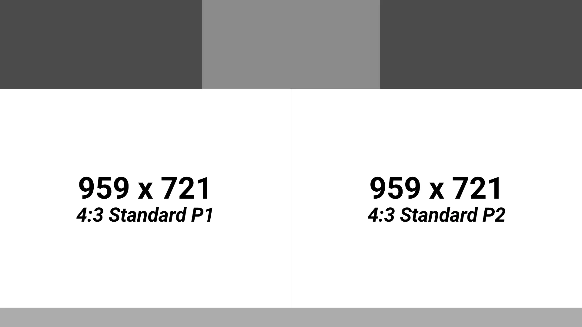
For 4:3 the size of the game for 2 runners actually perfectly fills the screen leaving plenty of room to spare for the run elements and cameras.
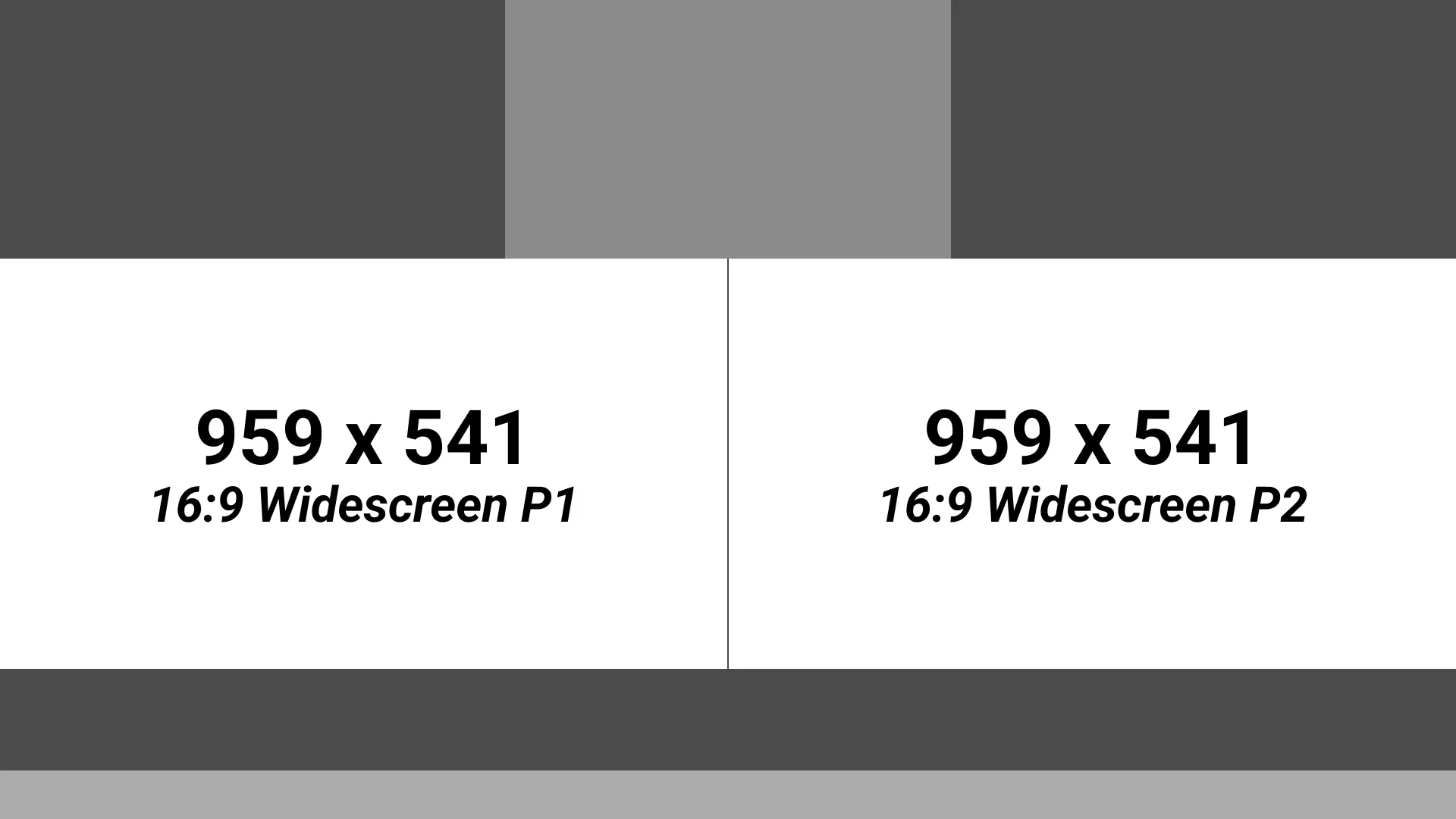
For 16:9 there will be significant space left over. The way I’ve attempted to minimise the space left over is to make the top elements taller and put the commentator/host information in the bottom bar.
3 player
Three player layouts are difficult as they are asymmetric. Some versions I have seen looks like they run a 4 player layout but have the 4th player game screen be the camera spot or leave it blank. The difficulty comes when trying to show which runner is playing which game.
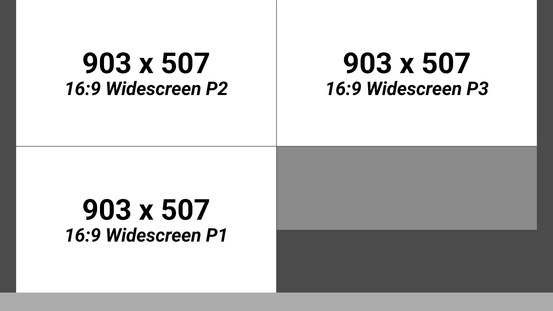
For ASM 2022 and PAX 2021 I made little custom icons and troed to keep it in a clockwise fashion so that the person on the left was playing on the bottom left and person on the right was playing top right. The only odd one out is the person playing top left. I have been given feedback about adding more labels next to the runner in the empty space between the game and edge of the screen.
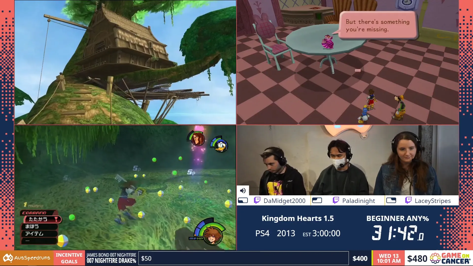
4 player
I do have to note that I have not developed a graphic specifically for 4 players as of yet.
For 4:3 the screen does split quite easily leaving a space in the middle for information.
Changelog
- 2023-02-10 Added more images, aspect ratio table
- 2023-02-09 Added info on: aspect ratios, ticker elements
- 2023-02-08 Added info on: game, category, runner name, intermission screen, run estimate, amount raised and charity name, camera, pronouns, current time, ticker, game metadata
- 2023-02-06 Initial post